 There’s been a lot of buzz about the impending rollout of Google’s revised mobile ranking algorithm; webmasters have been scrambling to get their sites to line up with Google mobile-friendly guidelines. For older websites this can mean entirely re-developing the site, deploying a secondary mobile site or even creating a branded web app to reach their mobile users.
How are these options different? All are viewable on your phone, each has their limitations and strengths, and they all have very different SEO profiles. So let’s break it down and take a look at each one in detail.
Mobile Websites:
Most mobile websites are separate, often subdomains of the main site that are formatted to display just on phones. This is great in the fact the main site and mobile sites can be worked independently, without affect the other.
From an SEO perspective this isn’t really ideal as having two sites means splitting inbound links and social shares been both the mobile and parent site. I’m sure there’s some server side wizardry to deal with redirects and most sites seemed to have this together but not all and it’s yet another thing to have to deal with maintaining and monitoring..
Mobile Apps:
Mobile apps are similar to mobile websites except that users download an app to their phone/tablet to pull the content from server. There can be some benefits to this if there are features on your site that integrate with other apps (like putting events into a calendar app), or if the site itself is basically an app already with some support pages.
However for most business I really wouldn’t recommend this as a mobile solution. Having users download an app to view your site is an extra step in your conversion process, and one that can have the most impact as most users really don’t want to wait for an app to download, and it adds another icon to the app screen. The other major drawback is that app are platform specific meaning that to reach most mobile devices a business needs to develop three versions one for iOS, one for Android, and one for Windows Mobile.
Responsive Design:
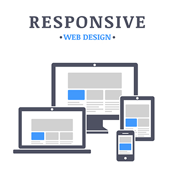
Responsive Design uses a combination of styling, scripting and display queries to flow the content of a site to fit the width of the screen it’s viewed on. Since the content is all coming from the same source any love from inbound links go where they belong, no server side magic required.
The only real downside to responsive design is that it’s complex, as there is a lot of CSS stylings required to work properly across a wide range of screen sizes and as a result development can take extra time and requires more testing to make sure final results line up across devices.
So which is the best option? My suggestion for most websites would be a responsively designed site, preferably using a Content Management System (CMS) to manage your content. This is the direction web development has been moving in for the last few years, and it’s most likely the way things will be for a fair bit.
All this being said a Band-Aid solution (and let me stress … it’s a Band-Aid) would be to get a separate mobile version of your site up now to avoid any de-ranking from this new algorithm. Services like Duda can convert your site over for a monthly fee, and this would do the job until your site can be re-developed. Not great … but better than not having a mobile site at all.